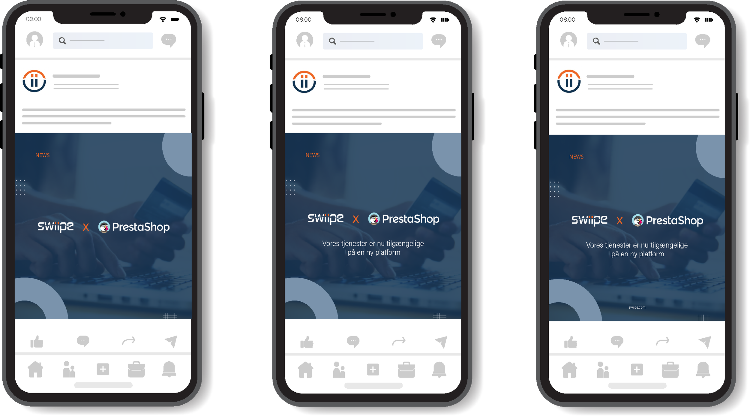
LinkedIn post mockup
This example is not far from what you already have, but a bit different.
There are too many confusing colours in the guidelines that do not work well together and give an overall dull feeling. Maybe a brand refresh will do the trick?
What I mostly tried with this layout and colours is to create some sort of visual balance for the eyes and to make it less dull.
There are 3 variants, a simple one that is self explanatory from my point of view and two others who have a bit of info included.